15 Data visualization: Flourish studio
This chapter presents the data visualization tools used by the PovcalNet team.
Flourish studio is a user friendly data visualization platform to create interactive data stories. It creats charts, maps and interactive graphs starting from your data.
Flourish offers both a free (Public) and paid service(Personal or Business). All data in the free (Public) version is available to the public. For this reason the PovcalNet team shares a paid account. Important: do not use sensitive or unpublished data in your own free account as anyone with a Flourish account will be able to see it (this applies to data in production or in internal servers available to the team before PovcalNet updates).
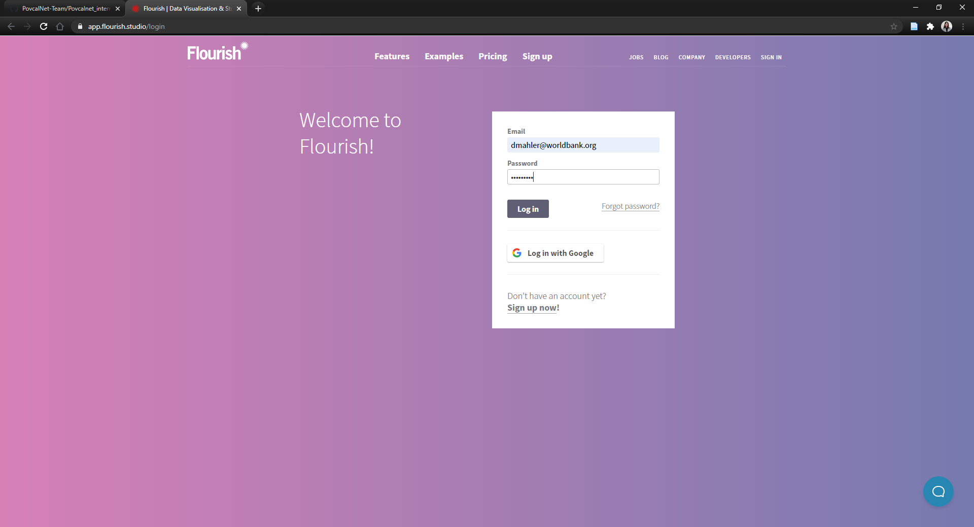
Here are the credentials for the team’s paid account:
- Email: dmahler@worldbank.org
- PW: PovcalNet
A quick overview of Flourish and how to sign in follows.
15.1 Sign in
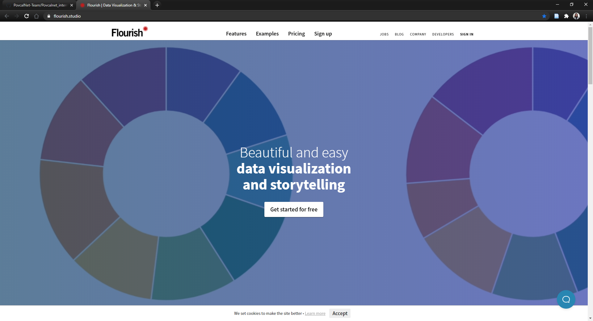
Follow this link for the Flourish homepage:

Figure 15.1: Flourish Homepage

Figure 15.2: SIGN IN

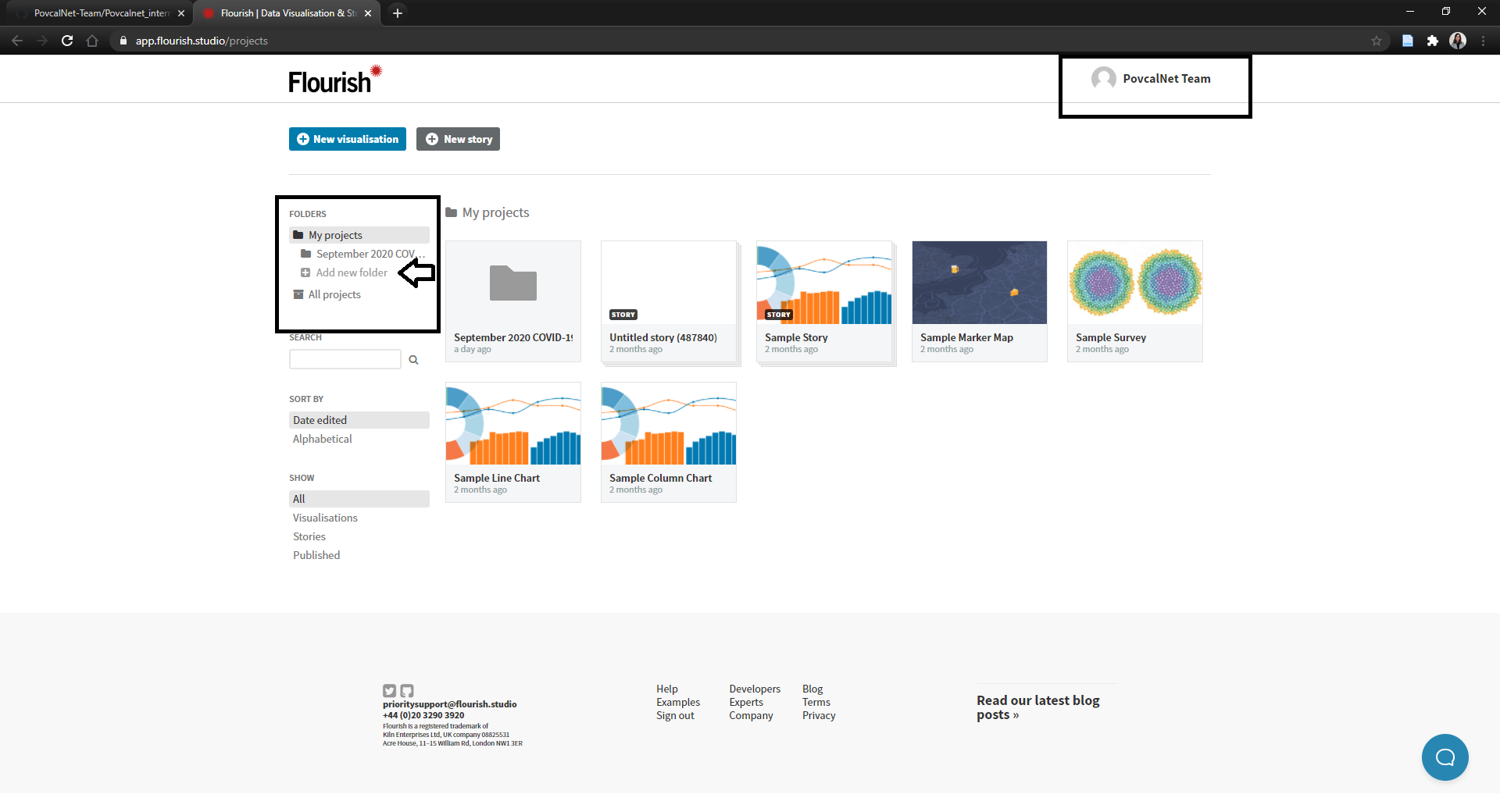
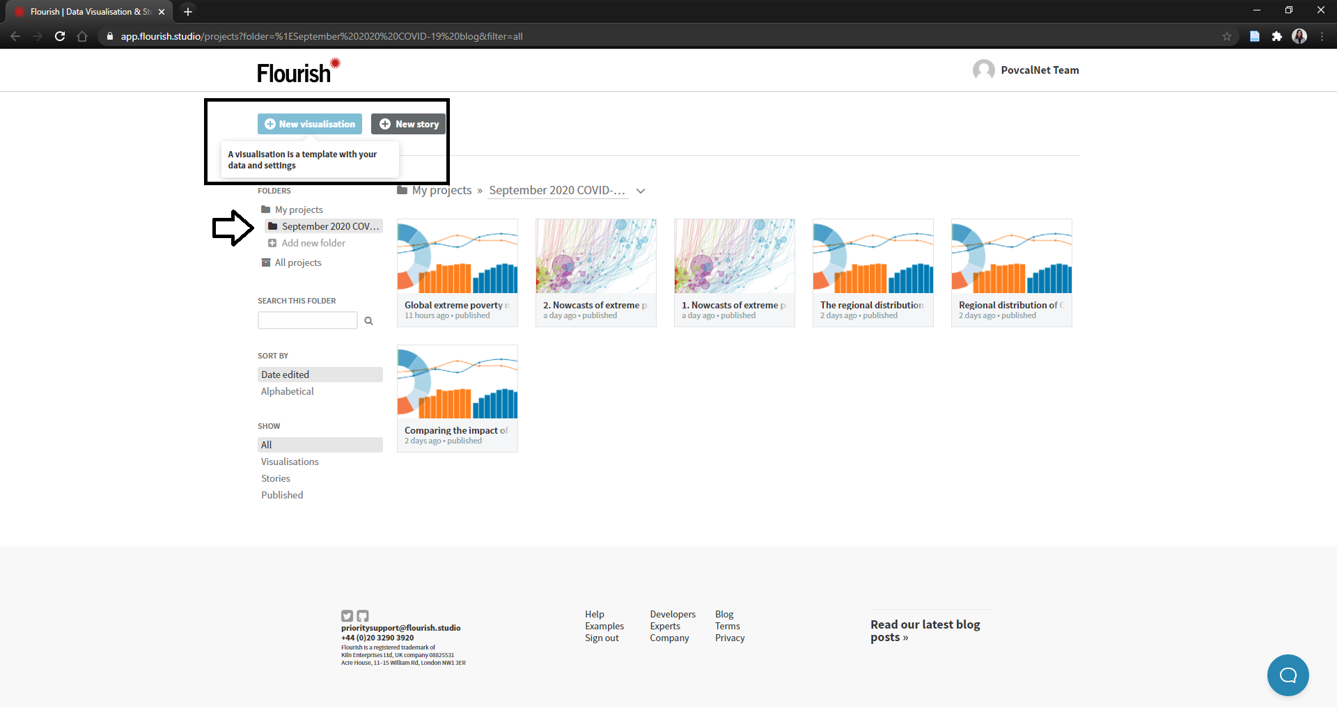
Figure 15.3: Flourish-PovcalNet Account
